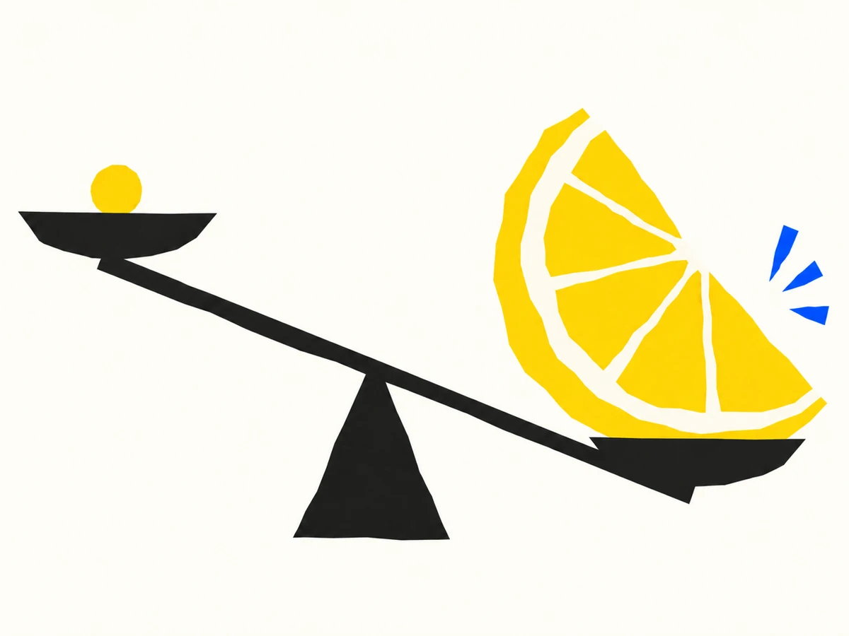
The bitterness of poor quality remains long after the sweetness of low price is forgotten.
A coin inside a lemon. A small saving, and the longer aftertaste of living with the result.
A small saving, a long aftertaste
I like the simplicity of a coin inside a cut lemon. Two familiar things put together, and suddenly they say something neither could say on its own. The coin suggests the pleasure of saving a little money. The lemon suggests the experience that follows. The idea is clear before the explanation arrives.
The phrase behind it stays with me: the bitterness of poor quality remains long after the sweetness of low price is forgotten. A price is easy to compare because it is right there in front of us. The experience of using something is less tidy. We discover that over time.

What are we actually saving?
In design, the first cost is only one part of the decision. There is also the time spent explaining something that should have been clear, the effort of working around an awkward experience, and the care needed to make a weak result feel convincing. Those costs are harder to put in a neat column. They still take up room.
That does not mean every expensive choice is good, or every inexpensive choice is a mistake. I am interested in whether the thing does its job with care. Sometimes a simpler solution is both better and more affordable. The question is what we are protecting when we reduce the budget, and what we quietly give away.
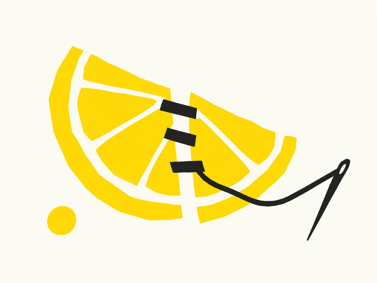
Care has to be visible
Quality can sound vague until it becomes a decision. A clear hierarchy. A useful label. A photograph that helps rather than decorates. Type that is comfortable to read. Enough attention to notice the small thing that makes the whole piece feel unresolved. Those choices are how care reaches another person.
I like starting with a rough drawing for this idea because polish alone can miss the point. A line can be imperfect and a message can still be exact. A simple shape and one clear contrast can be enough if the relationship between them is right. More detail would not automatically make the communication better.

Make the result worth living with
A good brief helps us decide where effort matters. What does this need to achieve? Who will use it? What has to be clear? What can we leave out? Those questions make it easier to spend attention well, instead of treating every detail as equally important.
For me, the lemon and coin are a reminder to look past the pleasant moment of paying less. The work will be seen, read and used after the price has faded from memory. I want the part that stays to be worth living with. What is something you have kept enjoying long after you stopped thinking about what it cost?
An invitation to keep thinking.
Share a thought